
Mobile-Friendly Shopping Experience: Why It Matters for E-Commerce Success
Introduction
The way people shop online has changed significantly. Today, customers use smartphones to discover products, compare prices, read reviews, and make purchases from almost anywhere. For businesses with an online store, providing a smooth mobile shopping experience is no longer optional. It is an important part of building customer trust, improving engagement, and increasing sales.
A mobile-friendly shopping experience allows customers to browse products, explore categories, and complete purchases easily on their smartphones. Businesses that prioritize mobile usability can make online shopping more convenient and create stronger relationships with their customers.
1. What Is a Mobile-Friendly Shopping Experience?
A mobile-friendly shopping experience means designing an online store that works smoothly on smartphones and tablets. The website should automatically adapt to different screen sizes while keeping its content clear, navigation simple, and features easy to use.
Customers should be able to view product images, read descriptions, check prices, add items to their carts, and complete payments without unnecessary difficulty.
A well-designed mobile shopping experience focuses on convenience, accessibility, speed, and simplicity. When customers can find what they need without confusion, they are more likely to enjoy shopping and return to the store in the future.
2. Why Mobile Shopping Matters for Businesses
Smartphones have become an essential part of everyday life, and customers increasingly expect businesses to provide convenient online experiences across devices.
A website that is difficult to navigate on a mobile screen can frustrate potential buyers and cause them to leave before completing a purchase. In contrast, a responsive and user-friendly online store helps customers explore products comfortably.
A mobile-friendly store can help businesses:
-
Reach customers who prefer shopping on smartphones.
-
Make product discovery faster and easier.
-
Improve customer satisfaction and engagement.
-
Reduce unnecessary obstacles during checkout.
-
Support sales opportunities from mobile visitors.
-
Build a consistent shopping experience across devices.
By investing in mobile usability, businesses can better meet customer expectations and remain competitive in the digital marketplace.
3. Responsive Website Design Improves Usability
Responsive web design allows an online store to adjust automatically to different screen sizes, including smartphones, tablets, laptops, and desktop computers.
Without responsive design, customers may need to zoom in to read product information, scroll horizontally, or struggle to select buttons. These issues make shopping inconvenient and can reduce confidence in the business.
A responsive website keeps text readable, images properly sized, and navigation elements accessible. Product listings, menus, and checkout forms should adjust naturally to the customer’s screen.
For e-commerce businesses, responsive design creates a more consistent experience and helps customers shop comfortably regardless of the device they use.
4. Fast Loading Speeds Keep Customers Engaged
Website speed plays an important role in mobile shopping. Customers often browse while travelling, taking breaks, or using mobile connections with varying speeds. If a website takes too long to load, visitors may lose interest.
Businesses can improve loading performance by optimizing product images, reducing unnecessary scripts, enabling browser caching, and choosing reliable website hosting.
A lightweight website helps customers move between product pages with fewer delays. Faster interactions can also make the overall shopping journey feel smoother.
Regular performance testing helps businesses identify problems before they affect a large number of visitors. Maintaining good loading speeds is therefore an important part of creating a reliable mobile shopping experience.
5. Simple Navigation Makes Product Discovery Easier
Customers should be able to find products without searching through complicated menus. On mobile devices, limited screen space makes clear navigation especially important.
An effective mobile store should include a visible search feature, well-organized product categories, useful filters, and straightforward menus.
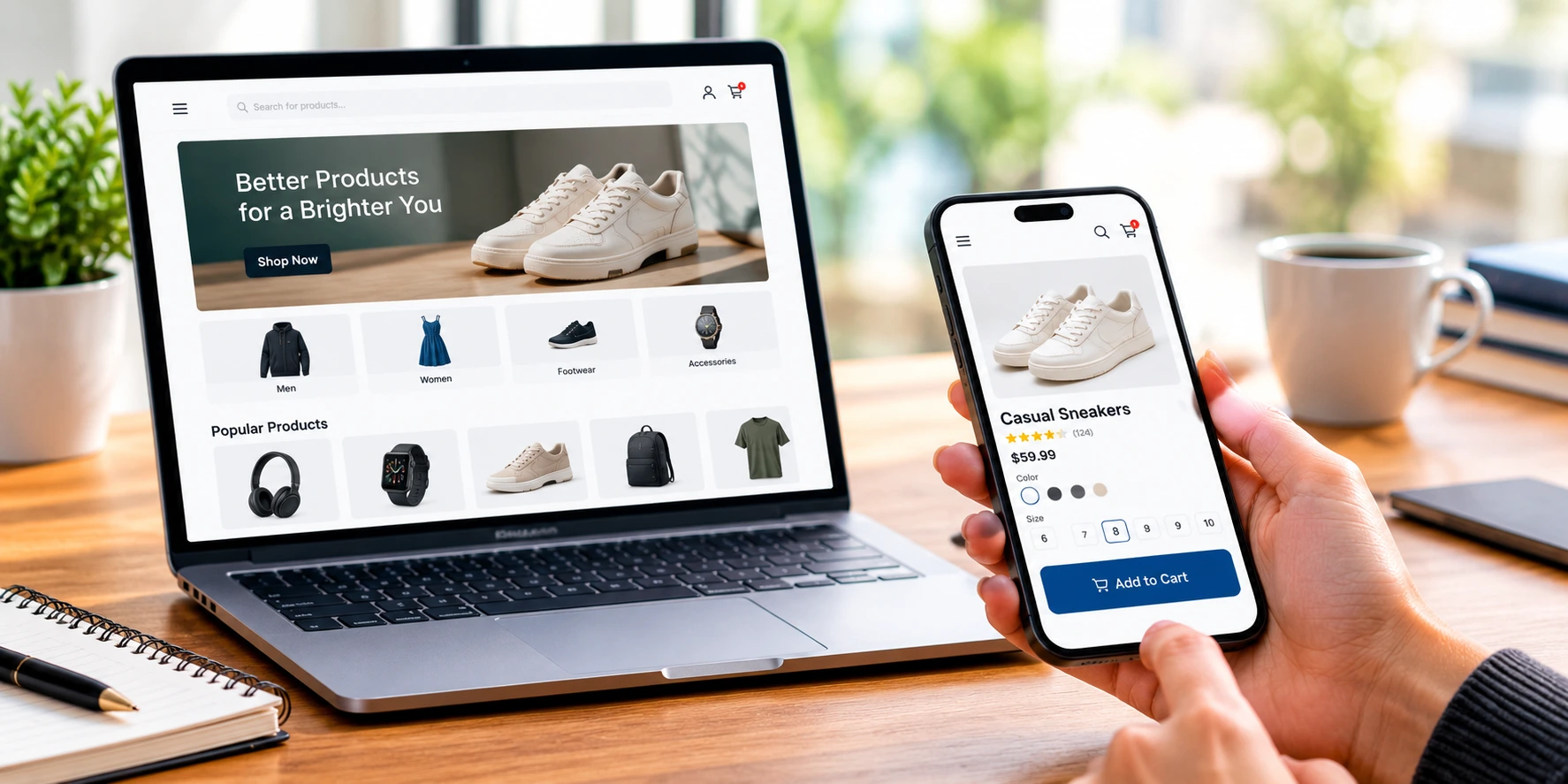
Product pages should display essential information such as prices, available sizes or variations, product descriptions, delivery details, and customer reviews.
Clear labels and a logical page structure help customers understand where to go next. When product discovery is simple, visitors can spend more time evaluating products instead of trying to understand how the website works.
6. A Smooth and Secure Mobile Checkout
The checkout process is one of the most important stages of online shopping. Even customers who are ready to purchase may abandon their carts if the payment process is confusing or requires too many unnecessary steps.
Businesses can improve mobile checkout by providing:
-
Short and easy-to-complete forms.
-
Clear order summaries and pricing.
-
Guest checkout where appropriate.
-
Convenient, trusted payment options.
-
Transparent shipping costs and delivery information.
-
Visible security information and clear error messages.
Forms should be designed for small screens, with appropriately sized fields and buttons. Customers should also be able to review their orders before confirming payment.
A secure, transparent, and convenient checkout process helps build confidence and reduces avoidable barriers to completing a purchase.
7. High-Quality Product Images and Clear Descriptions
Customers cannot physically examine products when shopping online. They depend on images, descriptions, specifications, and reviews to understand what they are buying.
Mobile product pages should use clear, optimized images that display properly without slowing down the website. Customers should be able to inspect important details, while image galleries should remain easy to navigate on smaller screens.
Product descriptions should be concise but informative. Include relevant information such as materials, dimensions, features, compatibility, available options, and care instructions when applicable.
Accurate product information helps customers make informed decisions and sets realistic expectations about what they will receive.
8. Mobile-Friendly Design Builds Customer Trust
Customers are more likely to feel comfortable shopping on a website that looks professional and works reliably. Poor formatting, broken links, unclear policies, and unexpected charges can create doubt.
Businesses should maintain consistent branding, display accurate contact information, and provide accessible shipping, return, refund, and privacy policies.
Using HTTPS helps protect information exchanged between the website and visitors. Businesses should also use reputable payment providers and follow appropriate security practices when handling customer data.
Customer reviews, transparent pricing, and clear product information can further strengthen trust.
Trust is especially important for new customers who may be discovering a business for the first time through a mobile search or social media link.
9. Optimize Your Mobile Store for Search Engines
Search engine optimization helps potential customers discover an online store when they search for relevant products or services.
A mobile-friendly website supports a better user experience and is important because Google primarily uses the mobile version of a website’s content for indexing.
Businesses should ensure that their mobile pages contain the same essential content as their desktop versions, including product descriptions, relevant headings, and important metadata.
Other useful practices include improving page speed, writing descriptive page titles, using meaningful image alt text, organizing internal links, and maintaining a clear website structure.
Mobile usability alone does not guarantee high search rankings, but it supports the accessible, useful experience that customers and search engines value.
10. Measure Performance and Improve Continuously
Creating a mobile-friendly shopping experience is an ongoing process. Businesses should monitor how customers interact with their online stores and use that information to identify opportunities for improvement.
Analytics tools can help businesses understand mobile traffic, popular product pages, cart activity, checkout completion, and conversion rates.
For example, if many mobile visitors view a product but leave before purchasing, the business can investigate whether the page loads slowly, product details are unclear, or checkout is unnecessarily complicated.
Testing different layouts, button placements, product displays, and checkout improvements can reveal which changes are most helpful.
Regular testing across different screen sizes and devices also helps ensure that the website continues to function correctly as technology and customer expectations change.
Conclusion
A mobile-friendly shopping experience is an essential part of building a successful e-commerce business. Responsive design, fast loading speeds, simple navigation, clear product information, secure payments, and convenient checkout all contribute to a better customer journey.
Businesses that understand and address the needs of mobile shoppers can make product discovery easier, build trust, and create more opportunities for sales.
At Digital Murugan, we understand the importance of combining effective website design with practical digital solutions. By focusing on usability, performance, and customer needs, businesses can develop online shopping experiences that support long-term growth.
Ready to improve your online shopping experience? A well-designed, mobile-friendly website can help your business serve customers more effectively and build a stronger digital presence.
 Previous Post
 Next Post