
How to Build a Strong Brand Identity: 7 Essential Elements
A strong brand is more than a logo.
When people interact with a business, they experience its colours, typography, website, social media, packaging, communication, photography, and overall visual style. Together, these elements create an impression of what the business represents.
That is why a professional brand identity needs to be consistent, recognizable, and meaningful.
Whether you’re starting a new business or improving an existing brand, these 7 essential elements can help you build a stronger brand identity.
1. Start With a Clear Brand Purpose
Before choosing colours, fonts, or designing a logo, understand what your brand stands for.
Your brand purpose should answer a simple question:
Why does your business exist beyond simply selling a product or service?
A clear purpose can help guide many future branding decisions.
Consider:
- What problem does your business solve?
- Who do you serve?
- What value do you provide?
- What makes your approach different?
- What do you want customers to remember about you?
For example, two businesses may offer similar services but position themselves very differently.
One might focus on affordability and convenience, while another may emphasize premium quality and personalized service.
Neither approach is automatically better.
The important thing is that the brand identity reflects the position the business wants to establish.
Define Your Brand in a Few Words
Try describing your brand using three to five characteristics.
For example:
Professional → Reliable → Modern → Helpful → Innovative
These characteristics can become a reference point for future design and communication decisions.
2. Create a Distinctive Logo
A logo is one of the most recognizable elements of a brand identity.
However, a good logo isn’t necessarily complicated.
An effective logo should be:
- Clear
- Memorable
- Appropriate for the business
- Legible at different sizes
- Flexible across different applications
- Consistent with the brand personality
Your logo may appear on a website, business card, social media profile, presentation, packaging, signage, uniforms, or digital advertisements.
That means it needs to work in many different environments.
Don’t Try to Put Everything Into the Logo
One common branding mistake is trying to communicate the entire business through the logo.
A logo doesn’t need to explain everything.
Its primary job is to provide a distinctive visual identifier for the brand.
The broader brand identity can communicate the rest through colours, typography, imagery, messaging, and design.
3. Choose a Consistent Colour Palette
Colour plays an important role in visual recognition.
A strong brand usually doesn’t use random colours across different platforms.
Instead, it establishes a defined colour system.
This may include:
- Primary brand colour
- Secondary colours
- Accent colour
- Neutral colours
- Background colours
For example, a business might use one primary colour for important brand elements while using supporting colours for backgrounds, buttons, illustrations, and other visual components.
Don’t Use Too Many Colours
More colours don’t necessarily create a stronger identity.
A limited, intentional palette can often create a cleaner and more recognizable appearance.
The important thing is consistency.
If your website uses one shade of orange while your social media graphics use five completely different shades, the overall brand may feel disconnected.
A documented colour palette helps maintain visual consistency.
4. Select Professional Typography
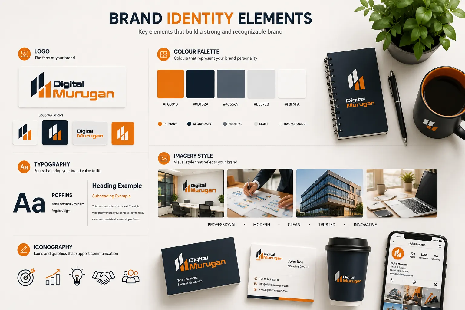
Typography is another important part of brand identity.
The fonts you choose influence how your communication feels.
A technology company might use clean, modern typography.
A luxury brand might choose typography with a more refined character.
A children’s brand could use something more playful.
Create a Simple Font System
Instead of using many different fonts, establish a small typography system.
For example:
Primary Font → Headings
Secondary Font → Body text
Accent Font → Limited special applications
Your typography should also remain readable.
A beautiful font isn’t useful if customers struggle to read your website, brochure, presentation, or advertisement.
Consistency Matters
Use the same typography system across important brand touchpoints wherever practical.
This creates a more unified visual experience.
5. Develop a Consistent Visual Style
A logo, colour palette, and typography are only part of the picture.
Your imagery and graphic style also contribute significantly to brand identity.
Think about:
- Photography style
- Illustration style
- Icons
- Graphic elements
- Shapes
- Layouts
- Backgrounds
- Image treatments
- Social media templates
Imagine a company using premium, professional photography on its website but completely different cartoon-style graphics on social media.
Even if the logo is identical, the overall brand may feel inconsistent.
Create Visual Rules
Decide what your brand should generally look like.
For example:
Photography: Bright, realistic, professional
Graphics: Clean and minimal
Icons: Simple and consistent
Layouts: Spacious and structured
Images: High quality and relevant
These rules make it easier for different designers or team members to create materials that still feel like they belong to the same brand.
6. Establish a Clear Brand Voice
Brand identity isn’t only visual.
The way your business communicates is also part of your brand.
Your brand voice defines how your business sounds when communicating with customers.
It could be:
- Professional
- Friendly
- Confident
- Helpful
- Educational
- Conversational
- Premium
- Straightforward
The right voice depends on your audience and positioning.
Keep Your Communication Consistent
Imagine a company that sounds highly professional on its website but uses completely different language on social media.
That inconsistency can make the brand feel less established.
Your tone doesn’t have to be identical everywhere.
A LinkedIn post, website article, email, and social media caption may naturally have different formats.
But the underlying personality should remain recognizable.
7. Maintain Consistency Across Every Touchpoint
This may be the most important element of a strong brand identity.
A brand isn’t experienced through one logo or one website page.
Customers may encounter your business through:
- Google search
- Website
- Social media
- Business cards
- Presentations
- Packaging
- Advertisements
- Signage
- Proposals
- Invoices

Each interaction contributes to their perception of your business.
Create a Brand System
A brand system should provide practical guidelines for using your identity.
It can include:
Logo Guidelines
How the logo should and shouldn’t be used.
Colour Guidelines
Approved brand colours and their applications.
Typography Guidelines
Primary and secondary fonts.
Photography Guidelines
Preferred image styles.
Graphic Guidelines
Icons, shapes, layouts, and visual elements.
Voice Guidelines
How the brand communicates.
This makes consistency easier as the business grows.
Why Brand Consistency Matters
Imagine seeing the same company in three different places.
On its website, it looks modern and professional.
On Instagram, it uses completely different colours and graphics.
Then you receive a brochure that uses another logo, different fonts, and a different visual style.
Even if all three materials belong to the same business, the experience can feel disconnected.
Consistency helps create familiarity.
And familiarity can make a brand easier to recognize.
Consistency Doesn’t Mean Everything Must Look Identical
This is an important distinction.
Your website shouldn’t look exactly like your Instagram post.
Your packaging shouldn’t look exactly like your presentation.
Instead, they should share recognizable brand characteristics.
Think of it as:
Different formats → Same brand personality.
How to Keep Your Brand Consistent
A practical way to maintain consistency is to create a brand guideline document.
Even a small business can benefit from a simple guide.
It could include:
- Logo variations
- Logo usage rules
- Primary and secondary colours
- Font selections
- Photography style
- Graphic elements
- Social media guidelines
- Brand voice
- Examples of correct usage
- Examples of incorrect usage
The goal isn’t to create a huge document.
The goal is to give anyone working on your brand a clear reference.
What Happens When Your Brand Identity Is Strong?
A strong brand identity can make your business easier to recognize and communicate.

It can help create consistency across marketing materials and make it easier for customers to understand what your business represents.
More importantly, it gives your business a coherent visual and verbal foundation.
Instead of designing every new marketing material from scratch, you have an established system to work from.
That can save time while keeping your communication consistent.
Final Thoughts
Building a strong brand identity isn’t about making your business look expensive or following every design trend.
It’s about creating a clear, recognizable, and consistent identity that reflects your business and connects with the people you want to reach.
Start with your purpose.
Define your visual identity.
Choose your colours and typography carefully.
Develop a consistent visual style.
Establish your brand voice.
Then apply those decisions consistently across the places where people interact with your business.
A strong brand doesn’t happen because of one great logo.
It happens when every part of the brand works together.
 Previous Post
 Next Post