Simple and Easy Navigation
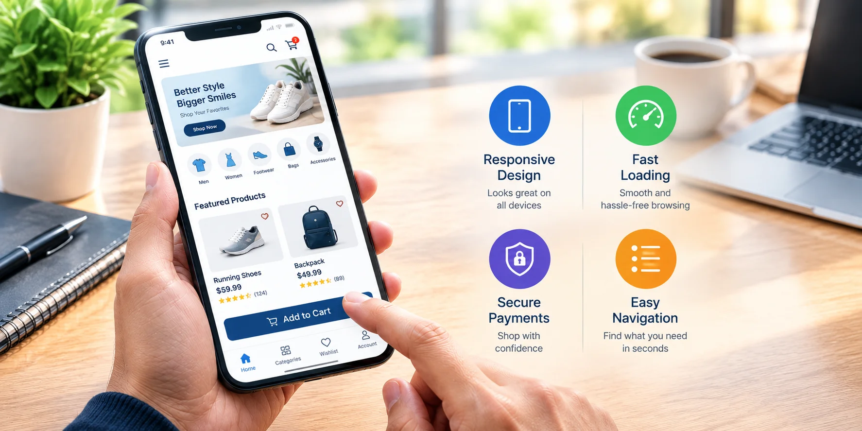
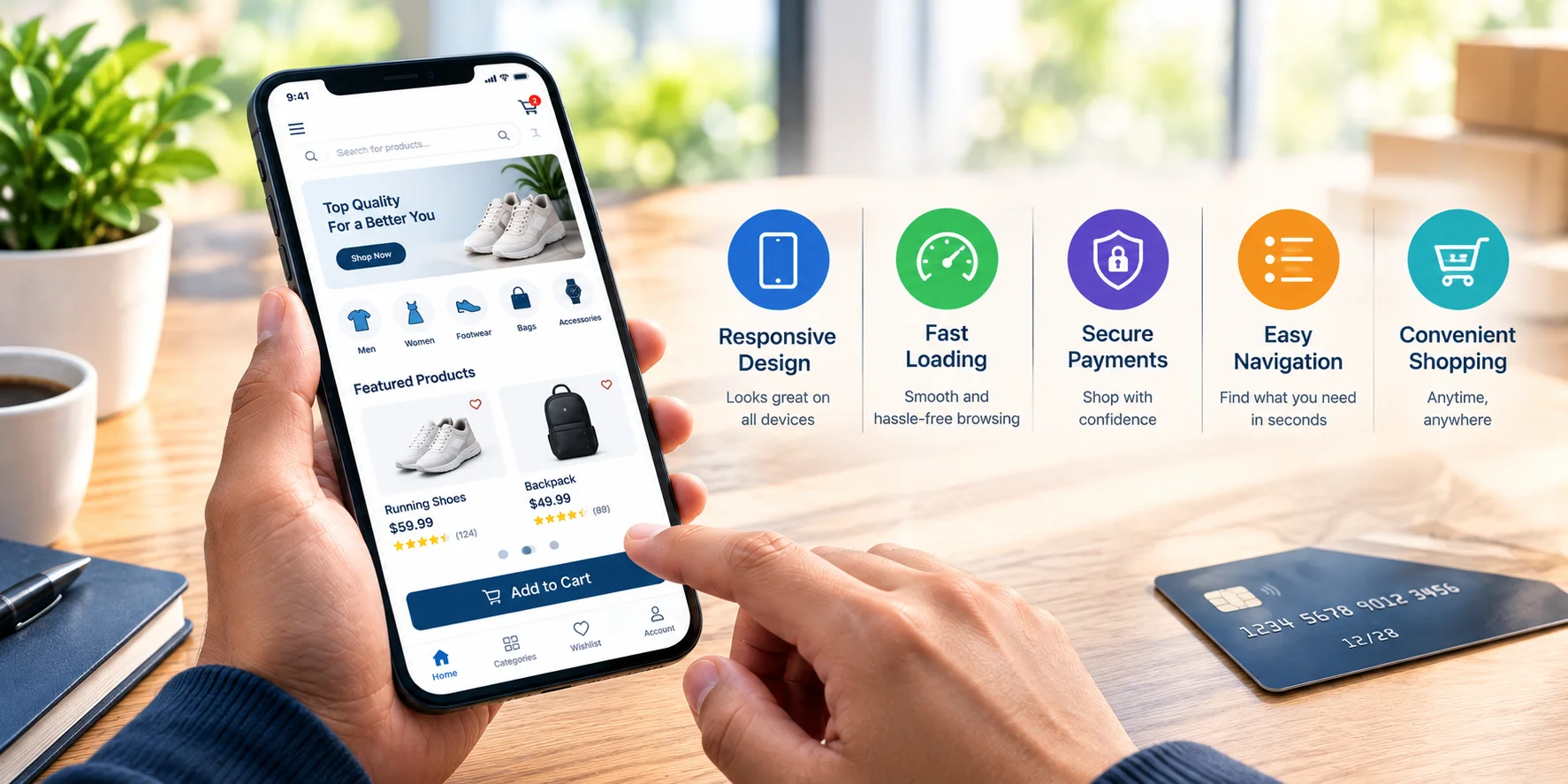
Mobile shoppers should be able to find products quickly without navigating through complicated menus. Clear categories, easy-to-use search features, and well-organized product pages make the shopping journey smoother.
A simple navigation structure helps customers move from product discovery to checkout with fewer unnecessary steps.
Fast Loading and Smooth Performance
Website speed is particularly important for mobile users. Large images, unnecessary features, and poorly optimized pages can make an online store slow to load.
Optimizing images, reducing unnecessary website elements, and using efficient technologies can help create a faster shopping experience. A responsive and well-optimized website keeps customers engaged and makes browsing more convenient.
Responsive Product Pages
Product pages should be designed to work properly on smaller screens. Product images should be clear, product information should be easy to read, and important details such as pricing, availability, specifications, and customer reviews should be presented in an organized way.
Call-to-action buttons such as Add to Cart and Buy Now should also be easy to see and use on a touchscreen.
Convenient and Secure Checkout
A complicated checkout process can cause customers to abandon their shopping carts. Mobile-friendly checkout should be straightforward, with clearly displayed fields and minimal unnecessary steps.
Providing convenient payment options and maintaining secure transactions can give customers greater confidence when completing their purchases.
A Better Customer Experience
A mobile-friendly shopping experience is not simply about making a website smaller for a phone. It is about creating an easy, fast, and convenient journey for customers from the moment they enter the website until they complete their purchase.
With the right e-commerce solution, businesses can create responsive online stores that provide a consistent shopping experience across different devices. This can help businesses reach customers wherever they browse and make online shopping more convenient.



 Previous Post